TurboTax Self-Employed Ownable Moment - 2017
Problem: How can we make a better connection between the marketing promise and the payoff in the product?
Stakeholders:
- Product Marketing
- Engineering
- Visual Design
- Design Technology
- TurboTax Senior Leadership
Role: Design lead
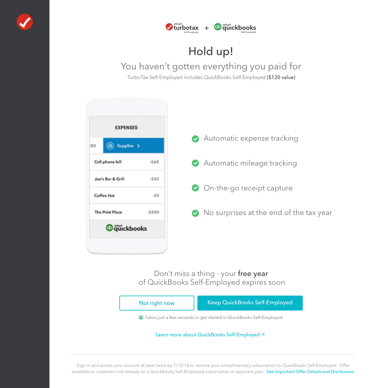
Overview: When a self-employed person files their taxes in TurboTax, we ask for the type of work they do. Then, based on that description, we recommend very, very specific types of self-employed expenses they can deduct (aka: industry specific deductions). You can learn more about this project here.
It’s an awesome feature because it helps customers find expenses they may not have thought about (aka: more money in their pockets) and, from a product perspective, there’s a lot of incredible data curation, handcrafted content, and love from our tax experts that went into it.
Challenges:
There were two main problems with this experience:
1. Customers had no idea all this work had been done and that the content they were seeing was truly personalized just for them, and
2. They weren’t connecting this moment to what we promised we’d do for them way back when they hit that ‘start’ button.
From the front door throughout the entire experience, the product needs to be consistently beautiful and functional for the payoff to happen. And it wasn’t happening.
A lot of the tax experience is entering data and answering questions, but there are a few moments where all the customer’s hard work and all the work being done behind the scenes comes together and we get a chance to do a big high five with our customers. And this needed to be of those moments
Process: We started with a simple question,“What is the story we want to tell?” Instead of just talking about the feature, we wanted to show the benefit and payoff.
We quickly came up with a few variations of the story. Both versions told a different story, and we actually do both, but in order to make a big impact and highlight the feature properly, you really need to narrow in on one consistent narrative with this kind of project.
Story #1: We leaned into the breadth of industries we cover, highlighting a few common industries with several recognizable expenses.
Story #2: We leaned into the depth of the expenses we can find, highlighting some of the more unique expenses you can claim.
Once we storyboarded our ideas, we got into the‘“hows” of this project: Which assets can we use? How can we customize the experience? How long should the transition last? How long will it take for the data to load or the customer to read the screen?
More challenges!
This is also the phase of the design process where we inevitably discover our limitations. In this case, there were some significant ones.
- We had to use an existing asset.
- The story had to loop.
- The animation couldn’t have text.
- We couldn’t customize the animation.
After many rounds of feedback with our stakeholders from marketing and product, we landed on the final animation. Then it was time for the content.
Here’s what I was thinking:
- What does the customer expect from this feature?
- What do they need to know at this point?
- How can we delight them?
- How much “talking” does the animation already do for me?
- How much space do we have?
- How long will it take the customer to read this?
- Will the content overshadow the animation?
- What happens before and after this moment — are we setting up the story and wrapping it up at the right point?
With those questions in mind, it was time to rewrite the story using a show and tell approach:
Step 1: Tell the customer what is going to happen.
Step 2: Show them the work that’s happening (that’s the animation)
Step 3: Show the payoff (in this case, the list of industry specific expenses)
As the content designer, here’s how I approached this:
Added more context: I adjusted the content on the screen before the animation to set the appropriate context and set up the moment.
Personalized what I could: Since we couldn’t customize the animation, I worked with engineering to pull in the customer’s line of work to the headline. This way, we were able to personalize the content in the header, which drives home the point that this is specific to the type of work they do.
Created an emotional connection: I also included some more nurturing language in the sub-header to create a deeper connection with the customer. Our extensive customer research often reveals people don’t feel like software can truly understand their unique tax situation, but we do. We really, really do.
We tested several concepts and went through multiple rounds of feedback before we finally landed on the content. Once we put that content and the new animation together, a totally new experience was born. You can see a video of the new experience here.
Results: The new experience does a much better job at setting up expectations and highlighting the payoff. It also ties the feature in much closer to what marketing was promoting on their end.
While I’m really pleased with the end result of this experience, there are still ways we can improve on the design. For example, the list of expenses after the animation still falls flat for me — especially since it follows a new, shiny design. There’s definitely opportunity to redesign this screen and carry the awesomeness of throughout the entire experience.
Despite room for more design tweaks, the feature is a success because it solves a big customer problem: We are helping them find more deductions, file with confidence, and get that max refund.